Challenge
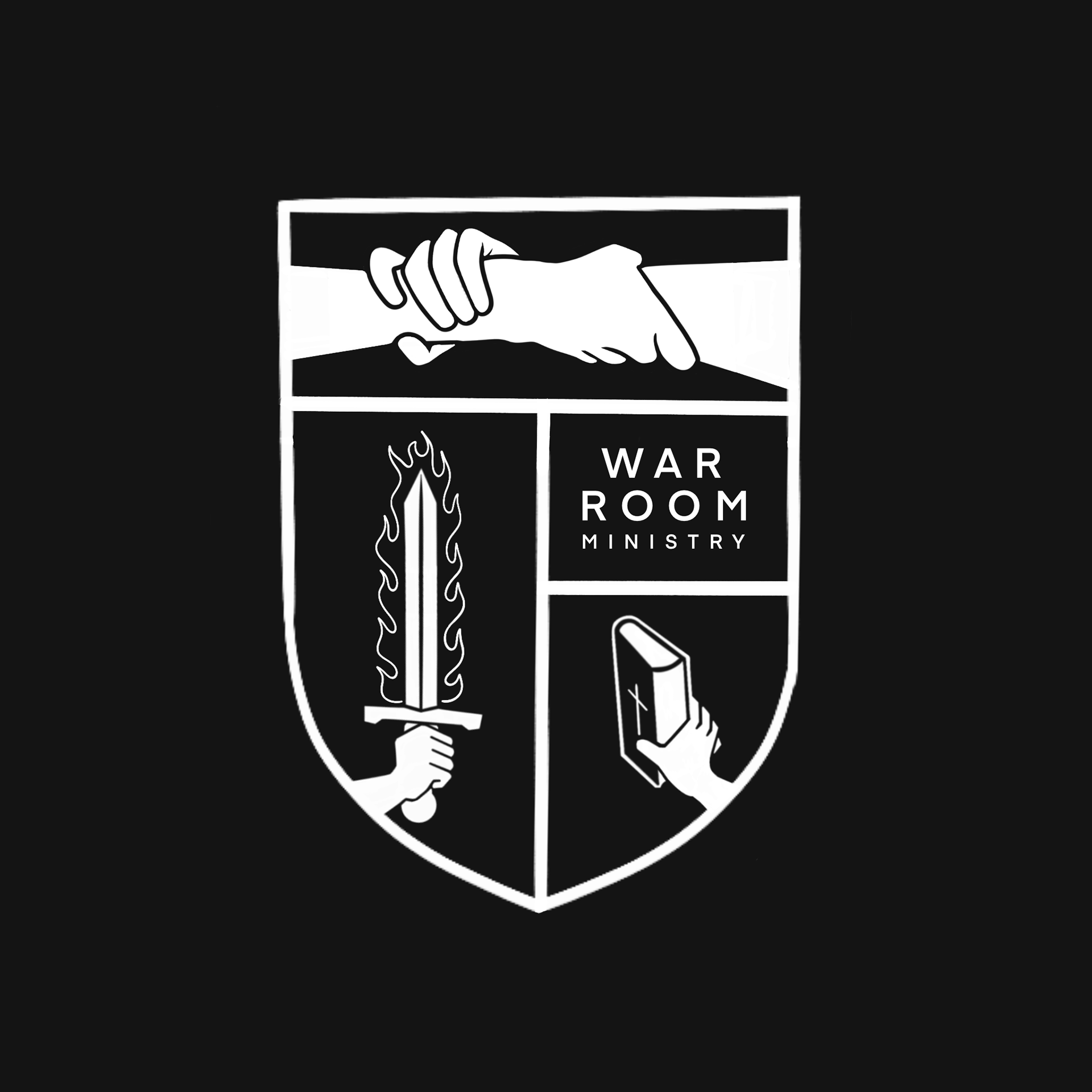
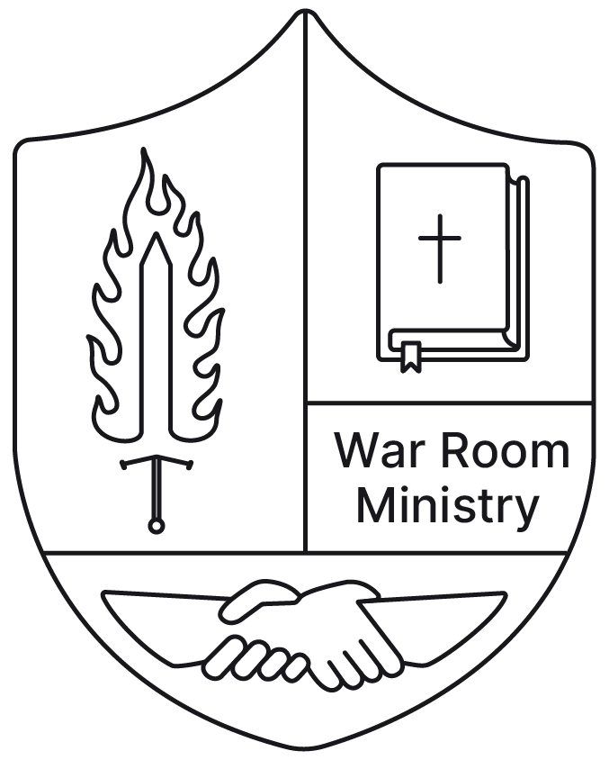
Creating an extremely minimalist logo and micro brand to match the websites pre-existing design while incorporating several key symbols that represent the company's identity.
Audience
Nondenominational Christian men aged 25-70, interested in fellowship & mentorship among likeminded men interested in studying the world of God.
Solution
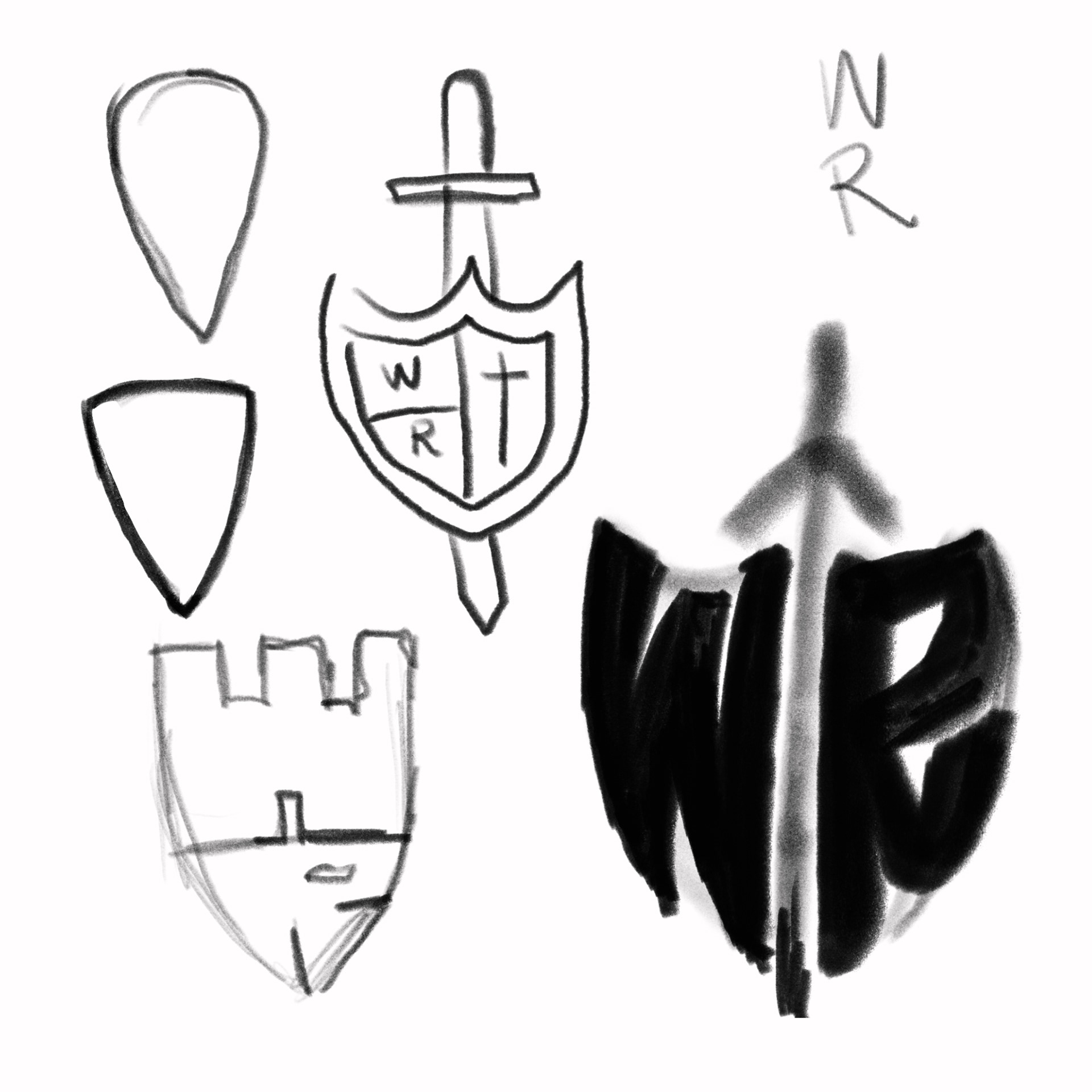
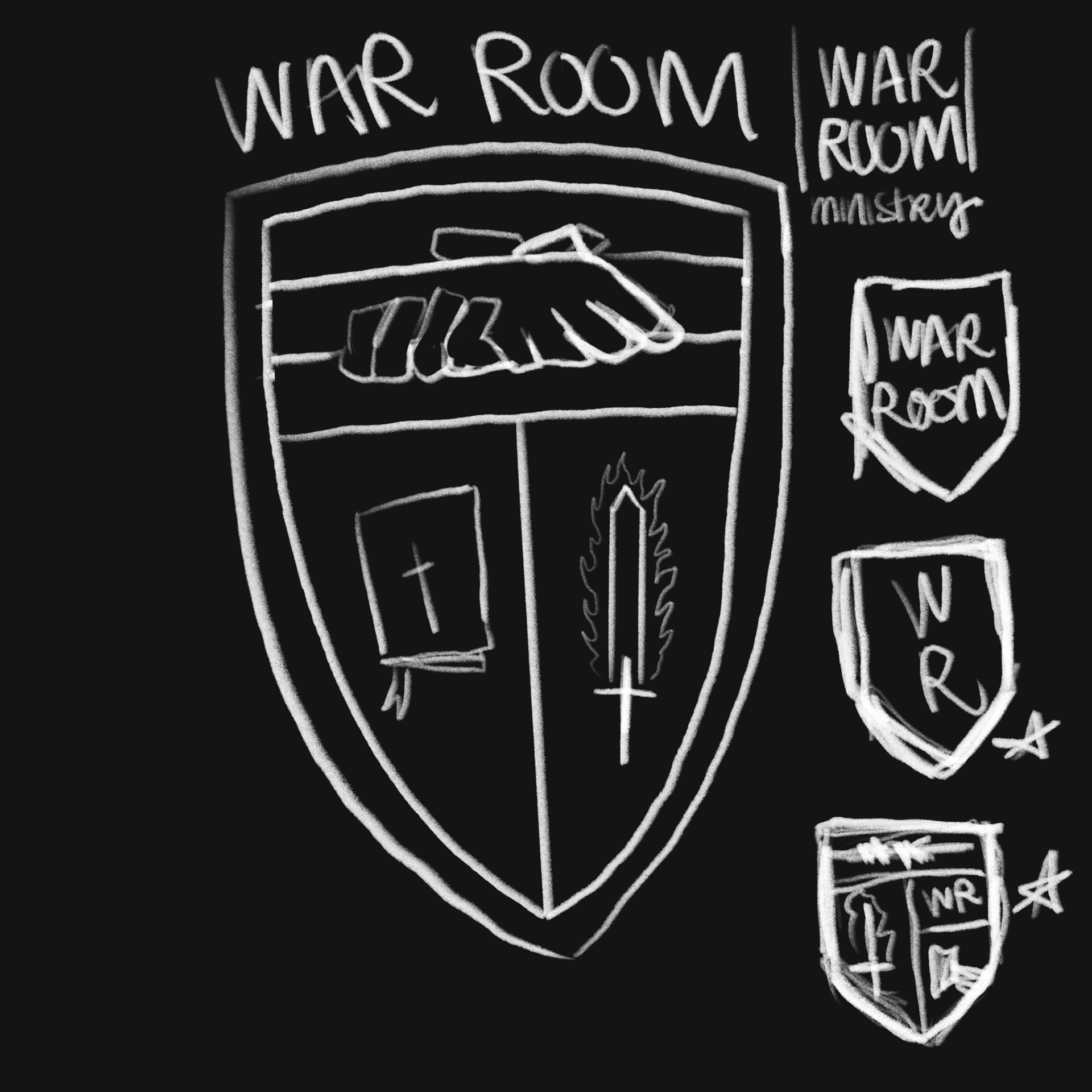
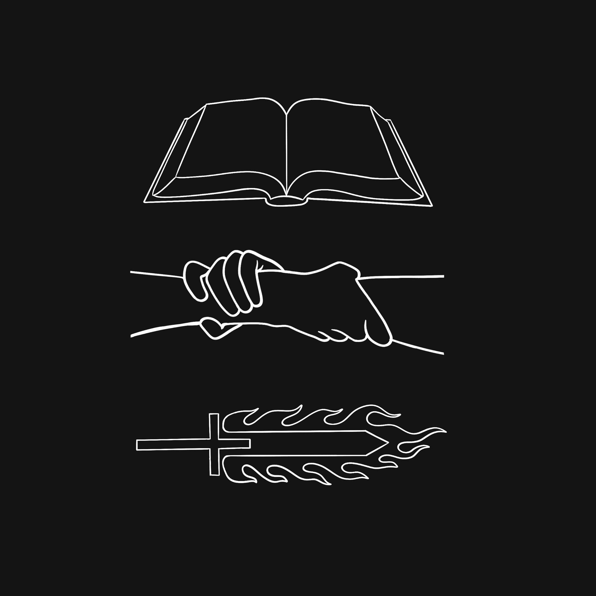
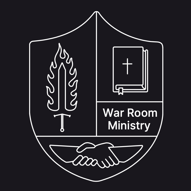
In order to create a logo that incorporates all the symbols necessary for this brand I was inspired by family crest designs which allowed me to seamlessly include those symbols in one space.
Research
Concepts
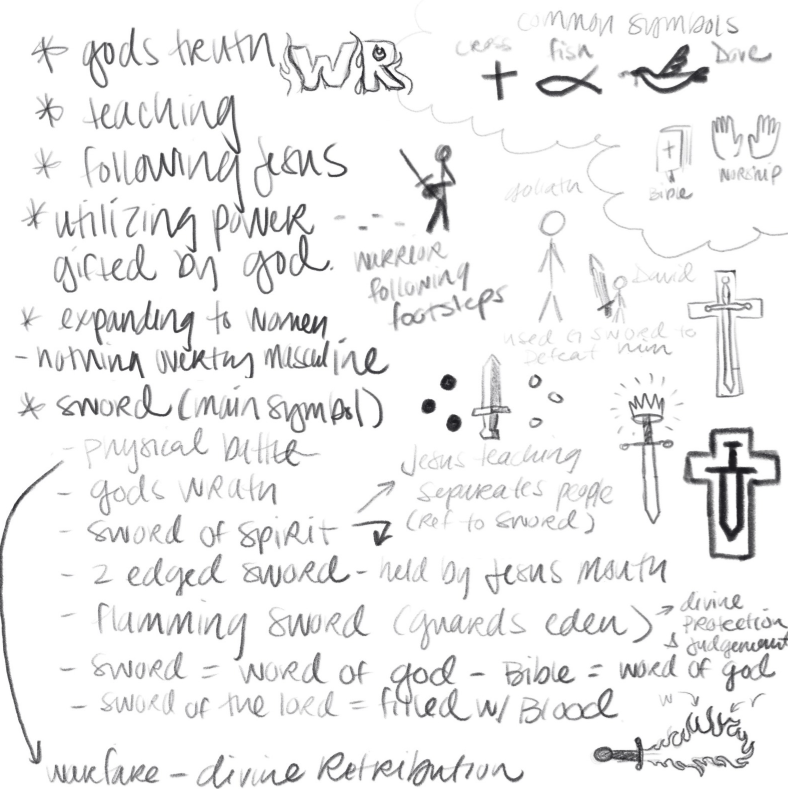
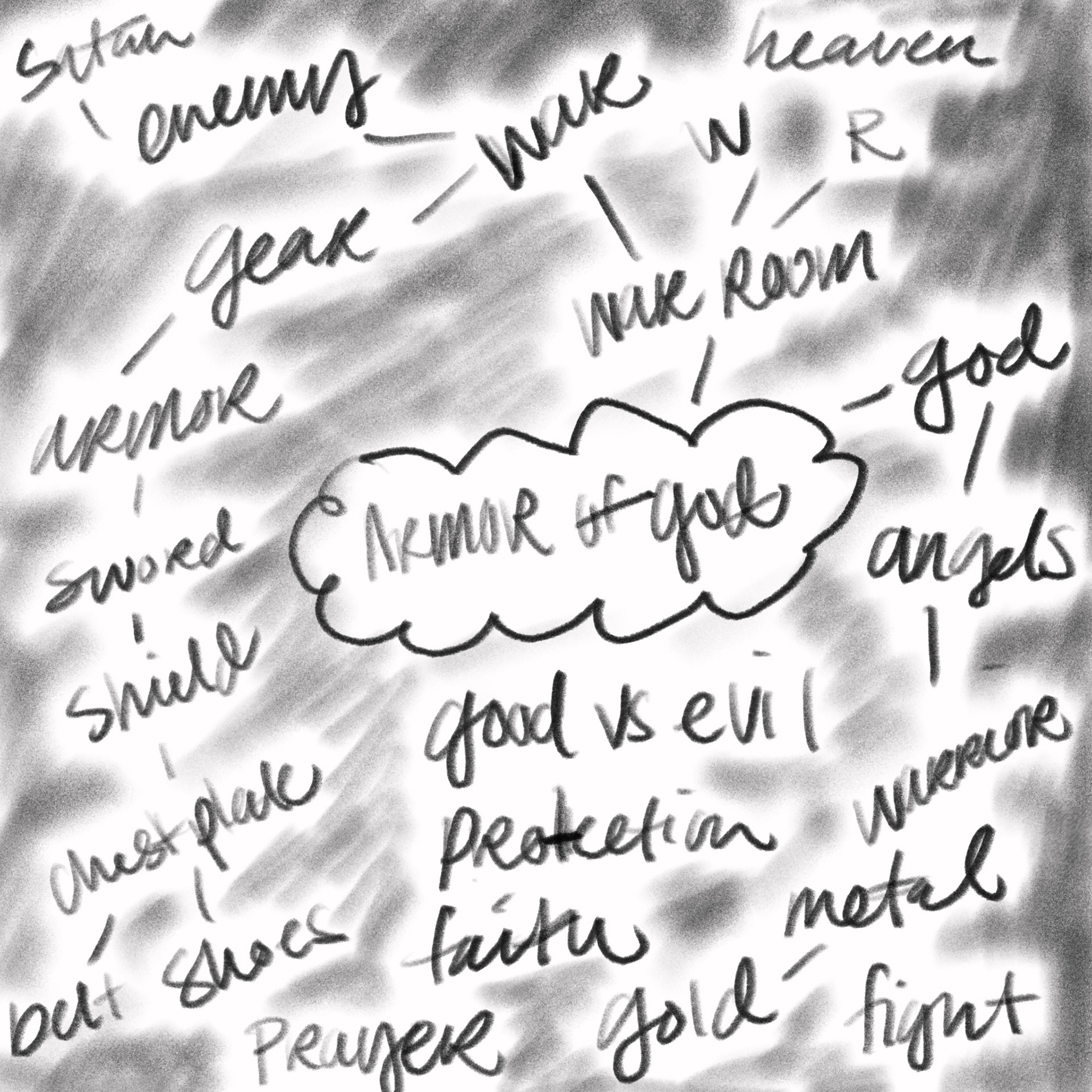
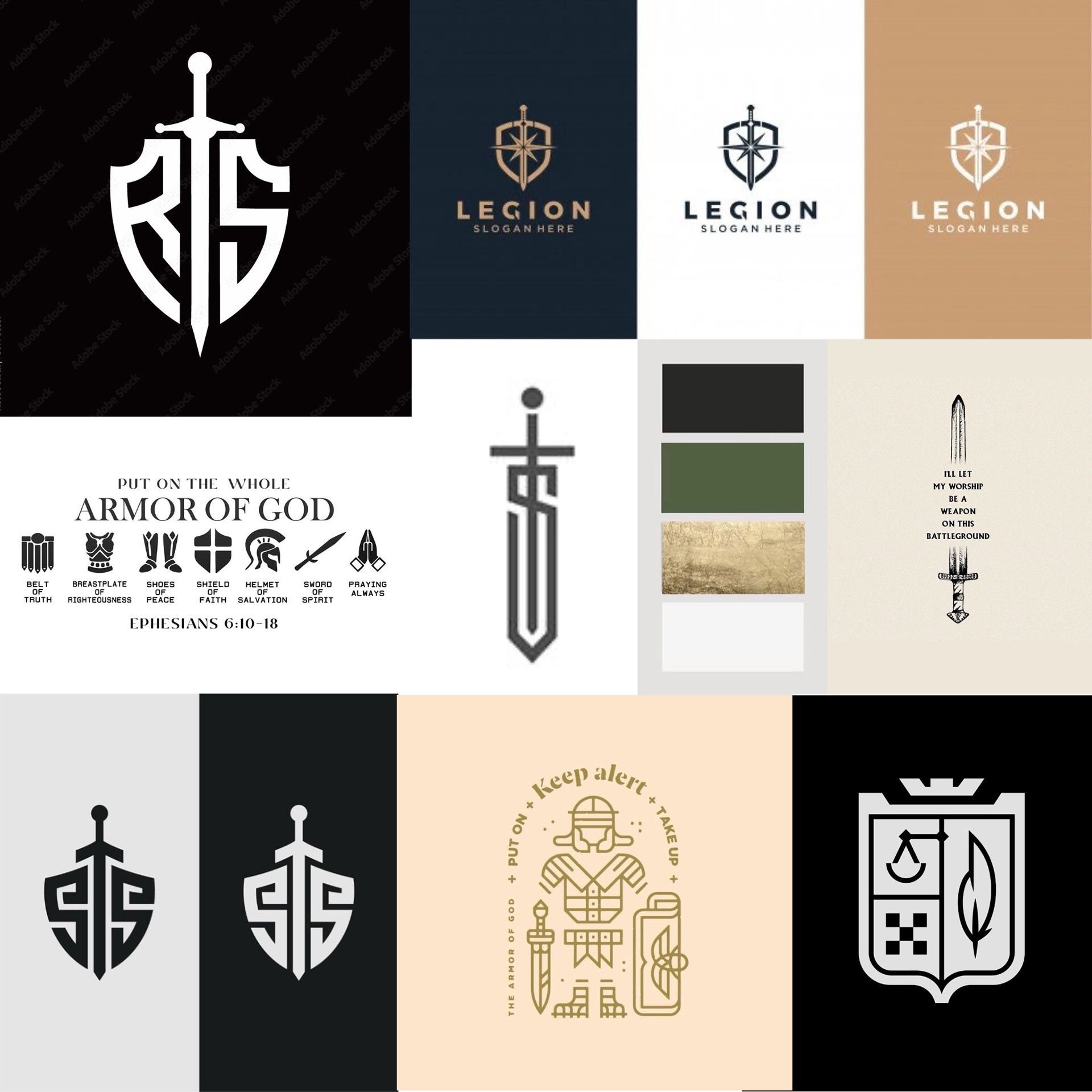
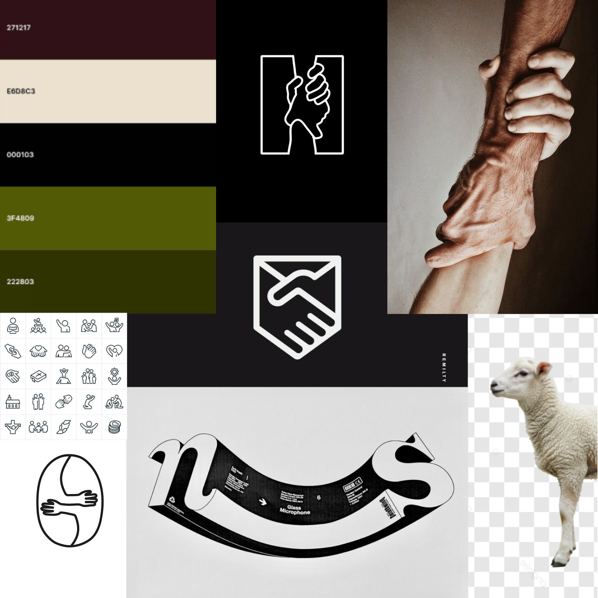
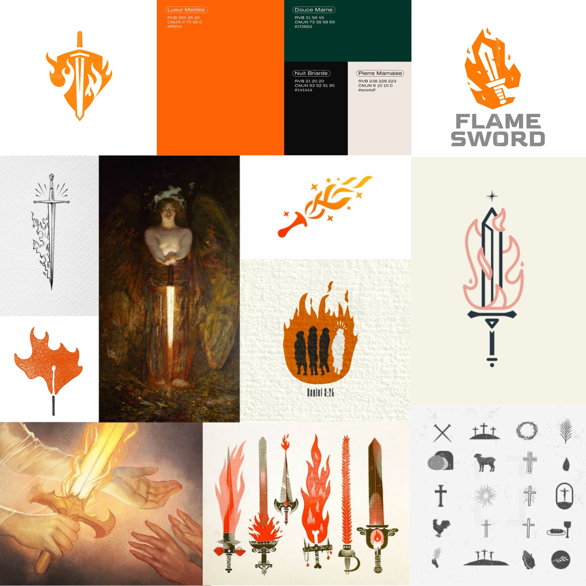
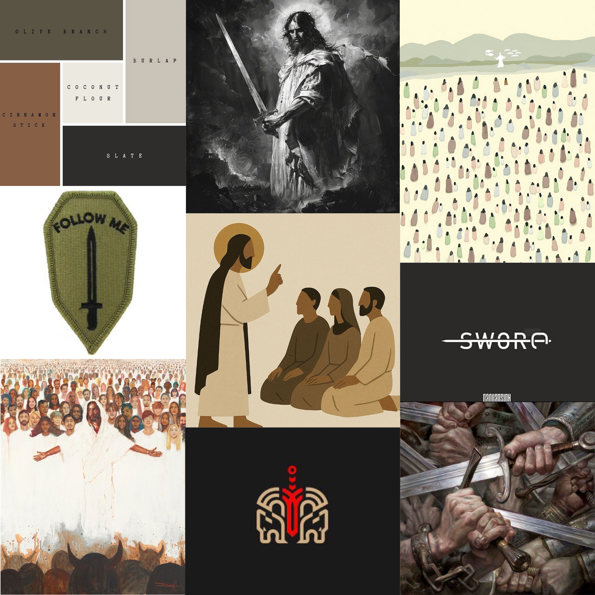
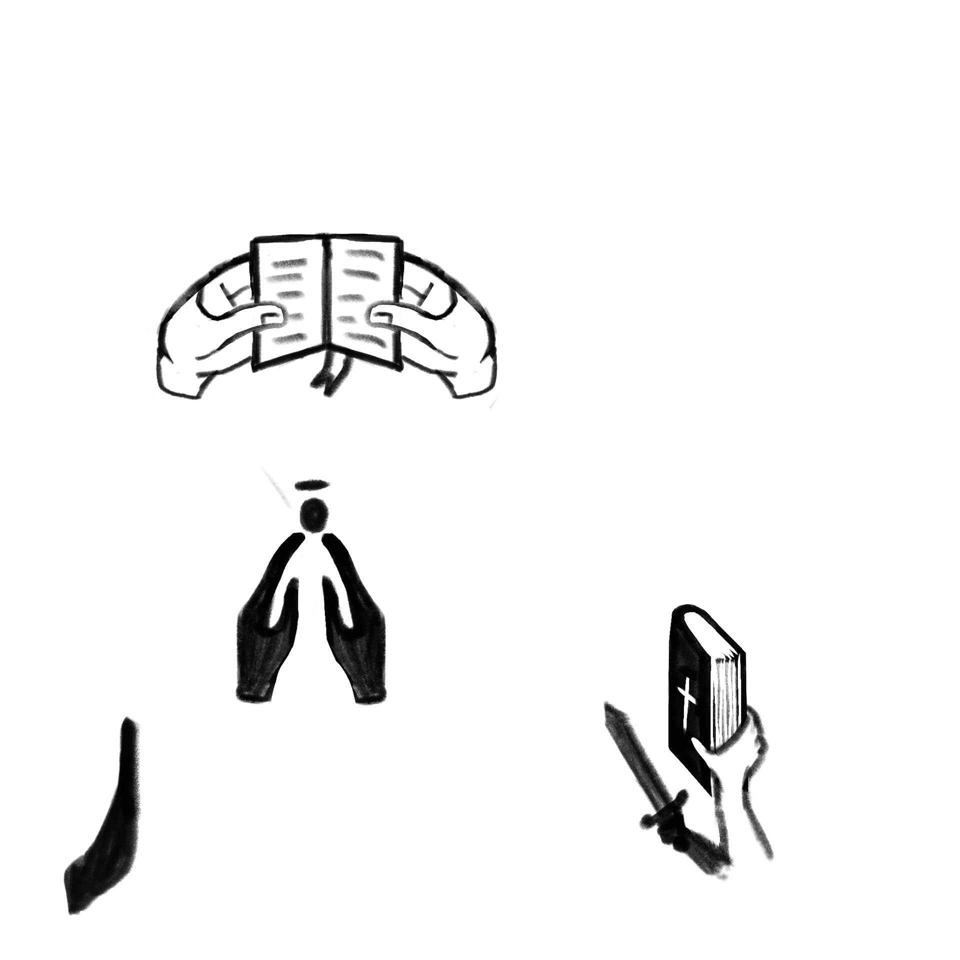
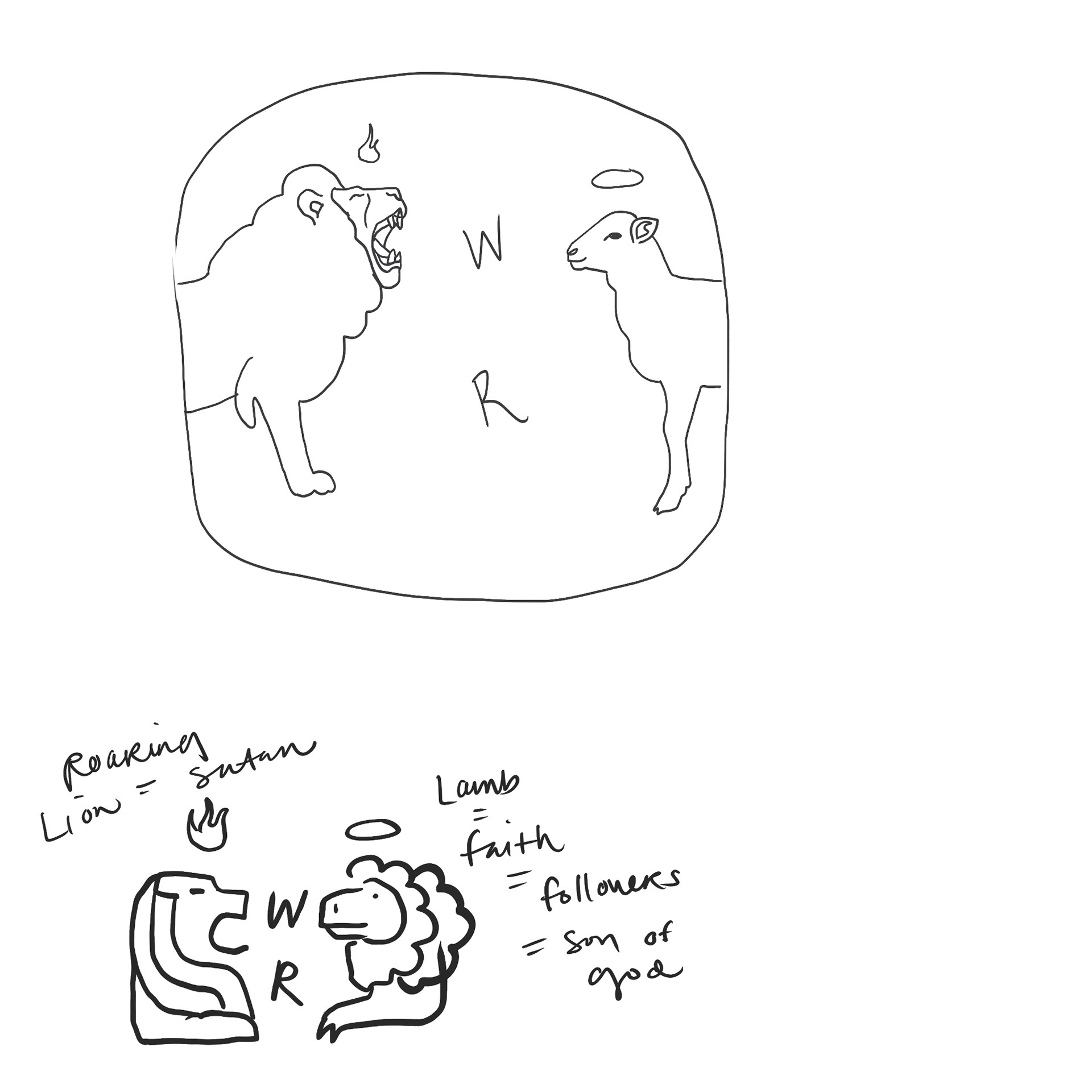
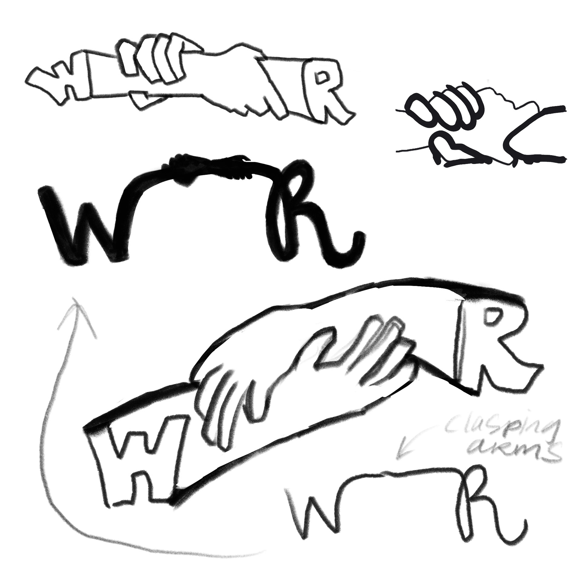
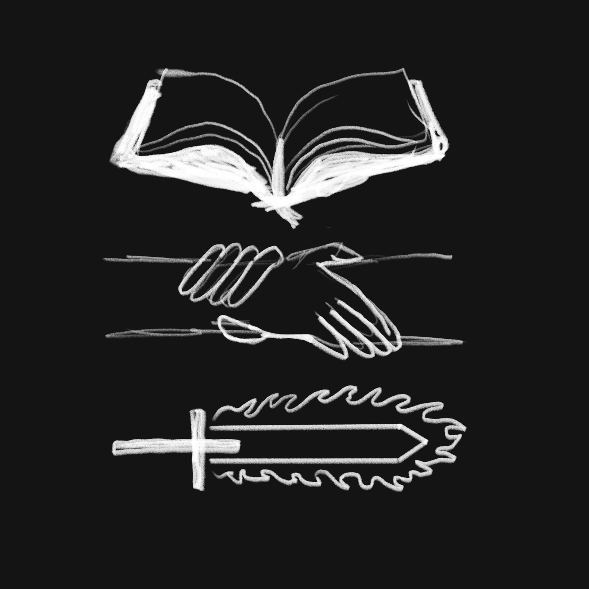
#1 - Armor of God #2 - Fellowship / Mentorship #3 - Burning Faith #4 - Sword of the Lord
Mood Boards
Armor of God
Fellowship / Mentorship
Burning Faith
Sword of the Lord
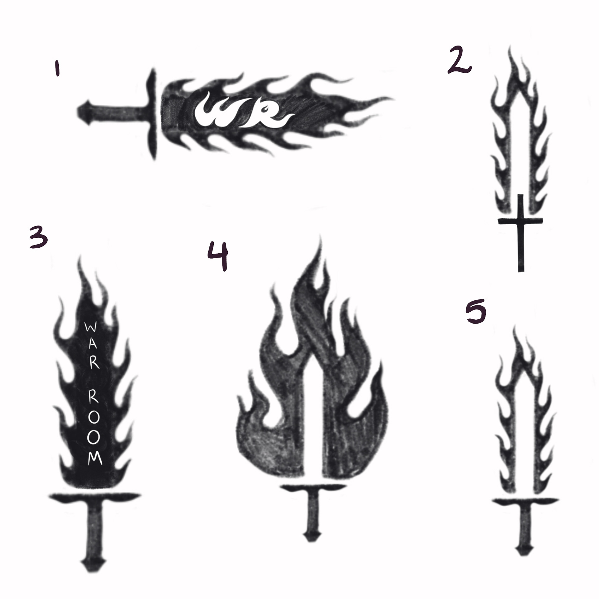
Sketches
Drafts
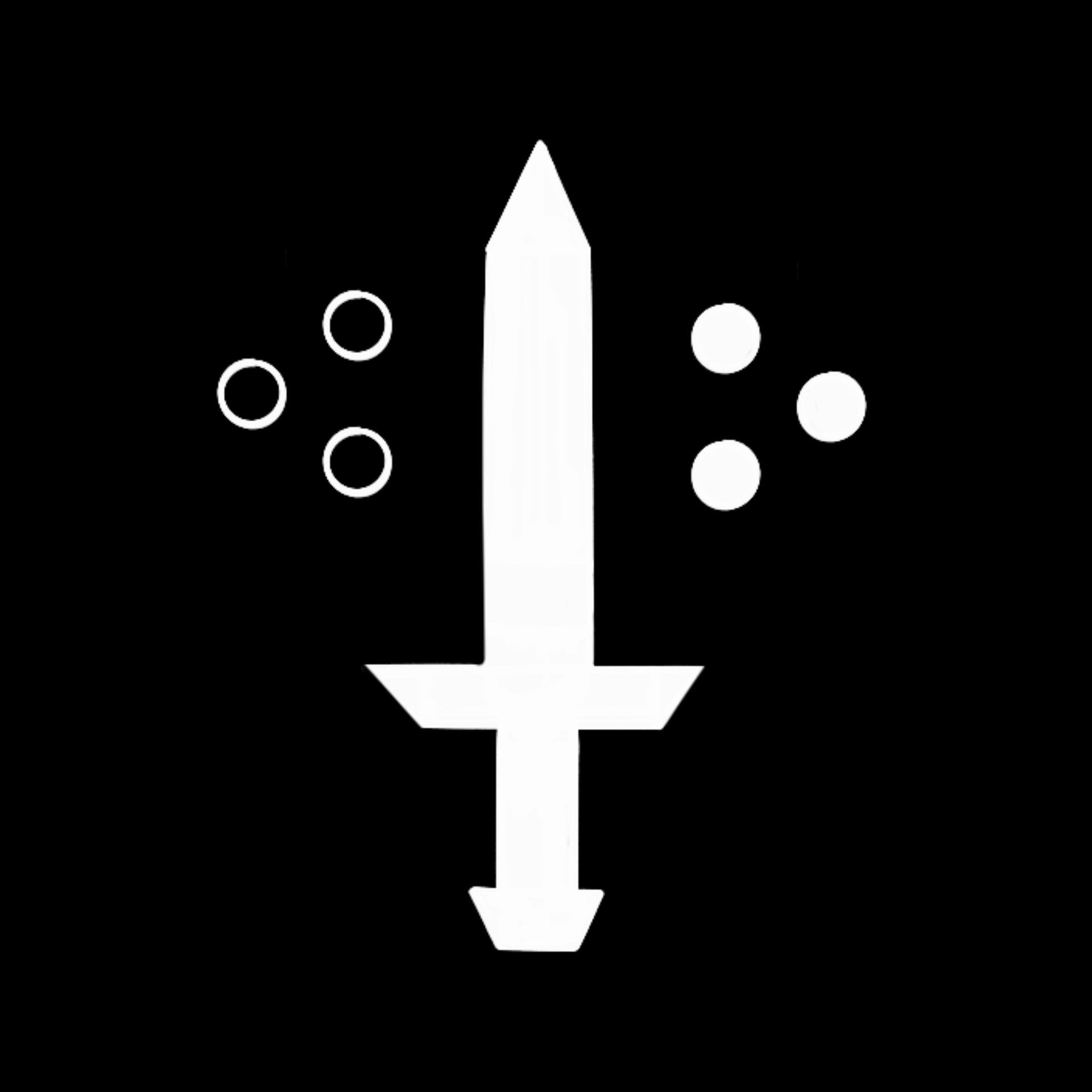
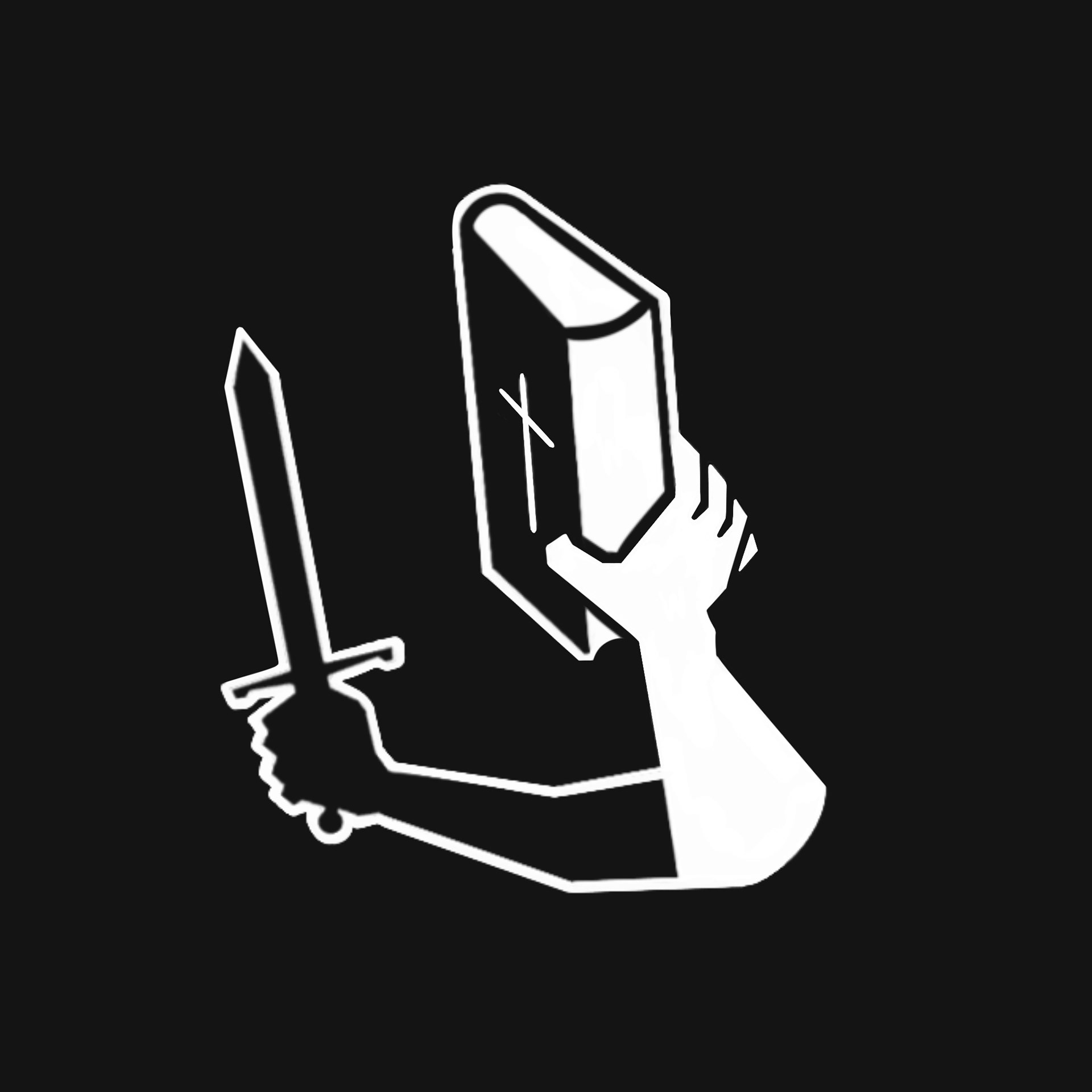
1st Drafts

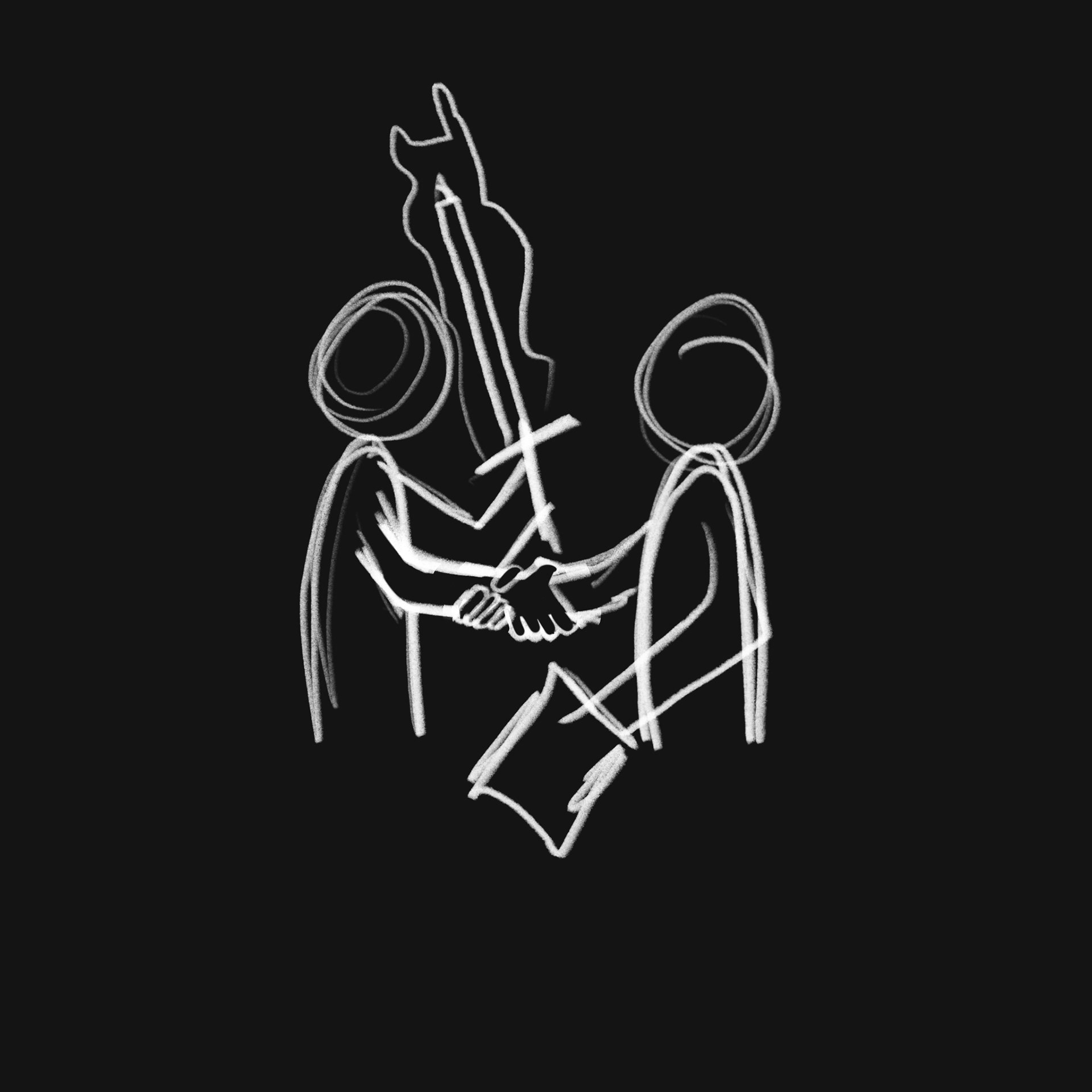
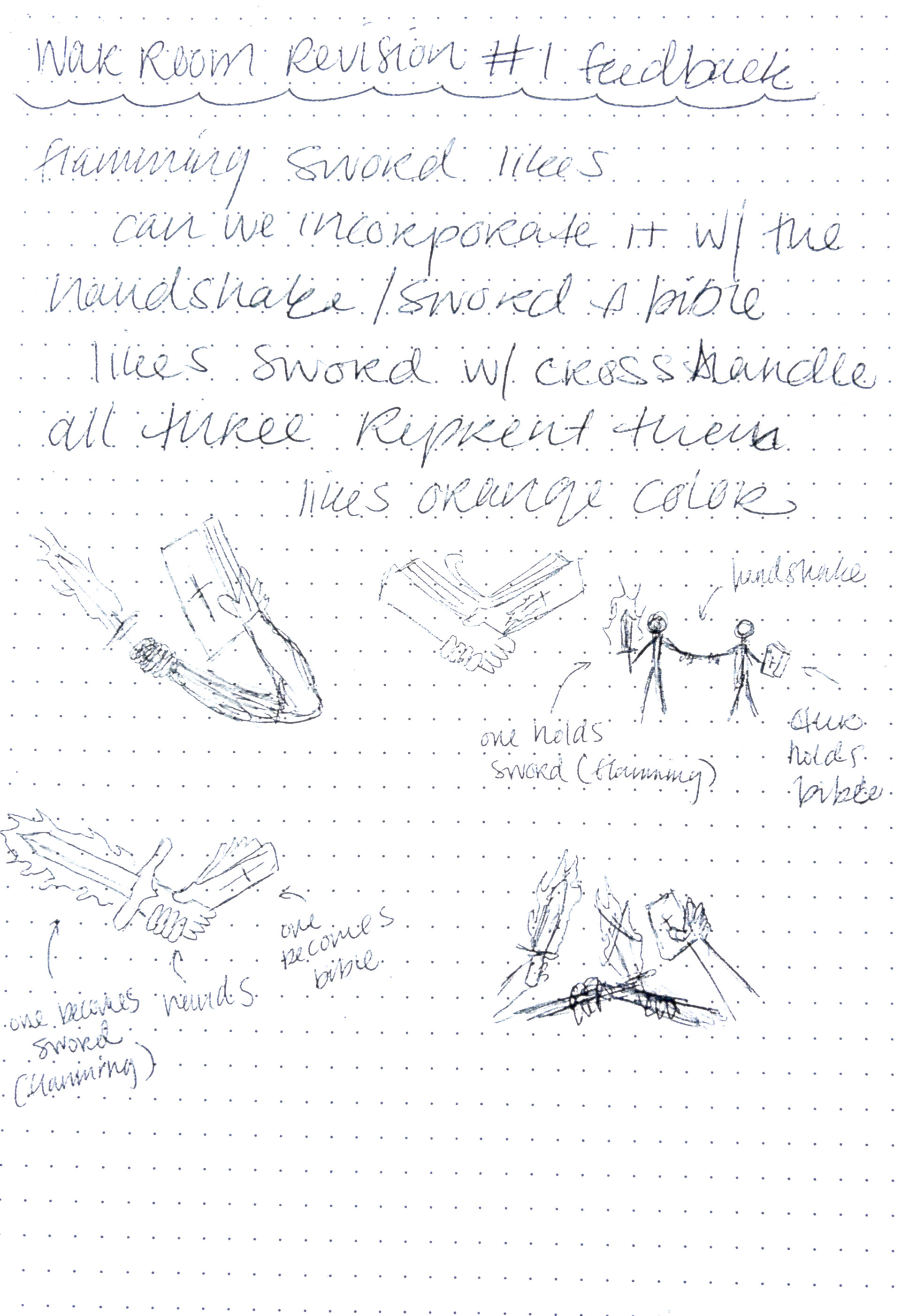
Revision Sketches
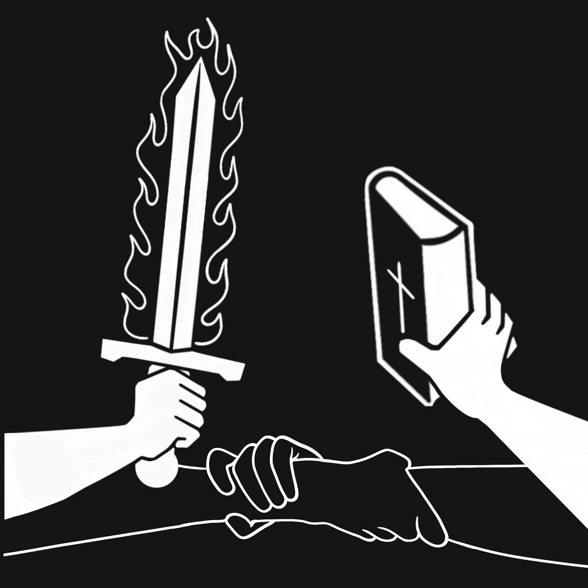
Second Drafts
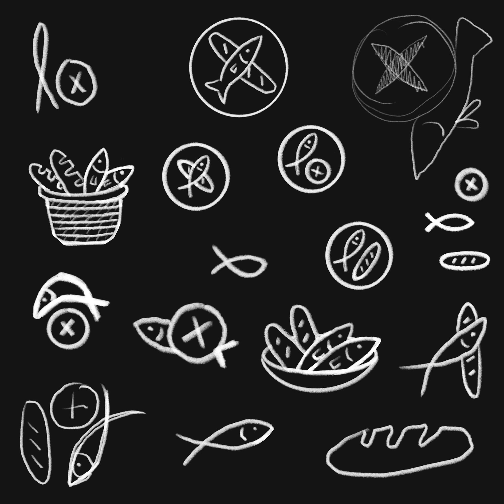
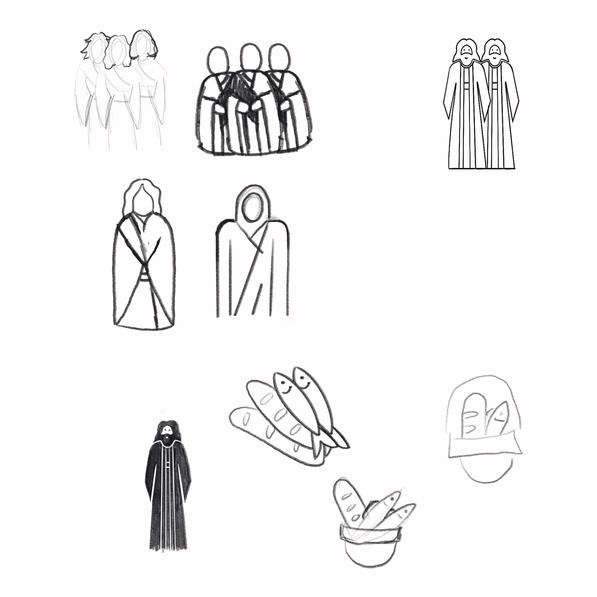
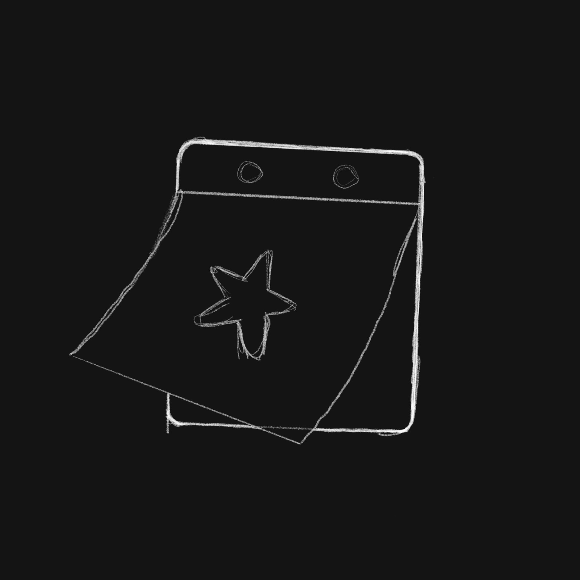
Icons
Sketches
Final
Event
Group

Breakfast
Mentorship

Style Guide
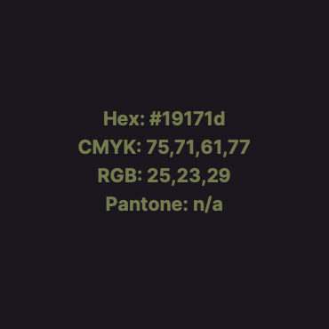
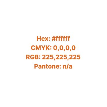
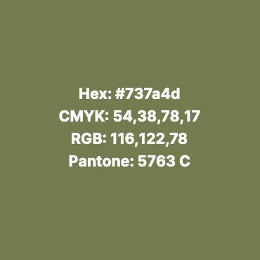
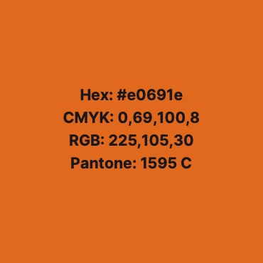
Color
Typography
Logo:
Inter Variable
Website:
UI San Serif
Regular
Medium
Semi-bold
Bold
Extra-bold
Regular Italic
logo
Primary logo
Lockups

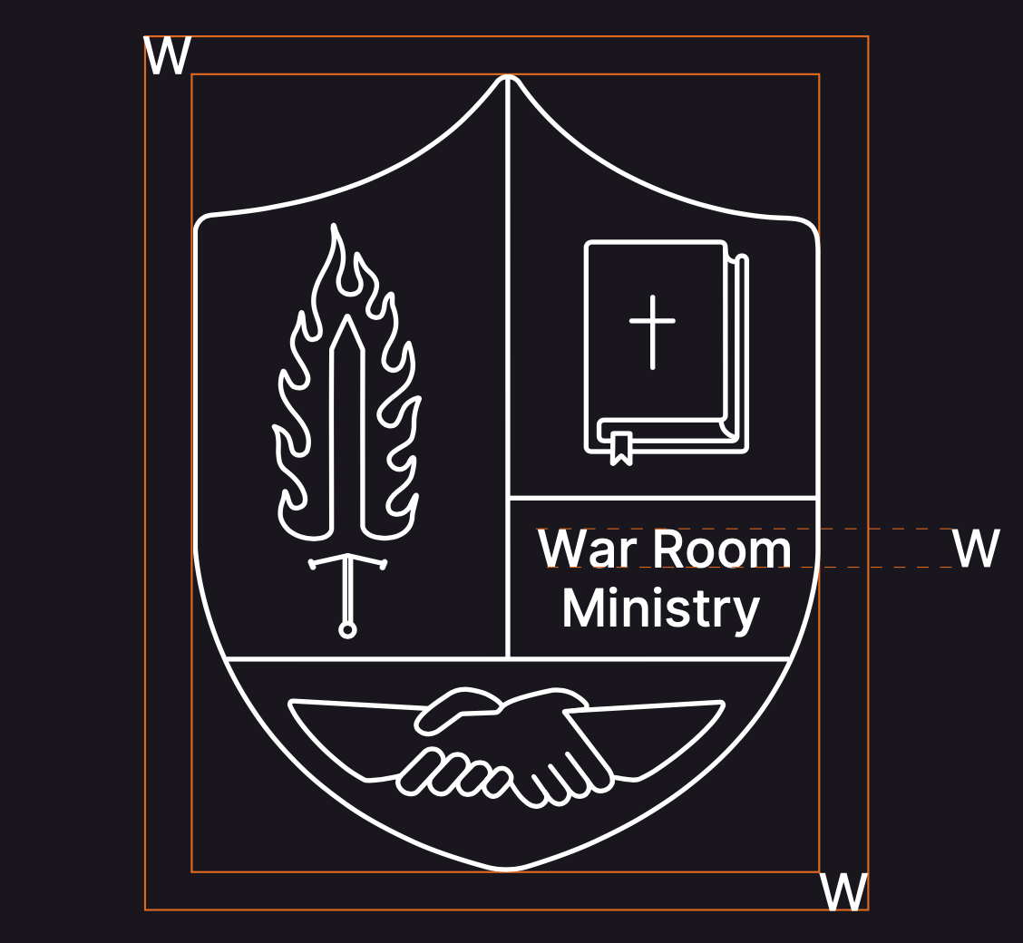
Spacing
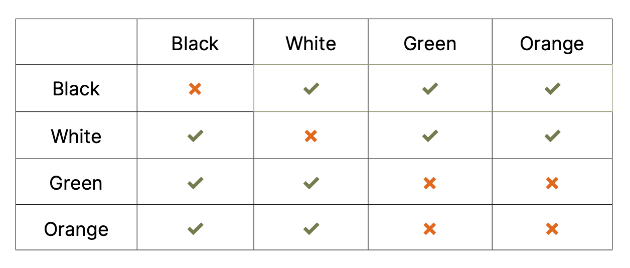
Color Usage
Brand Guideline
Please feel free to explore the mini brand guide created for the logo and icon designs.