Challenge
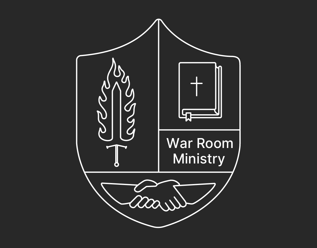
Creating an extremely minimalist logo and micro brand to match the websites pre-existing design while incorporating several key symbols that represent the company's identity.
Audience
Nondenominational Christian men aged 25-70, interested in fellowship & mentorship among likeminded men interested in studying the world of God.
Solution
In order to create a logo that incorporates all the symbols necessary for this brand I was inspired by family crest designs which allowed me to seamlessly include those symbols in one space.
Research
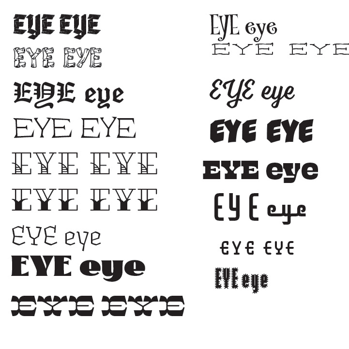
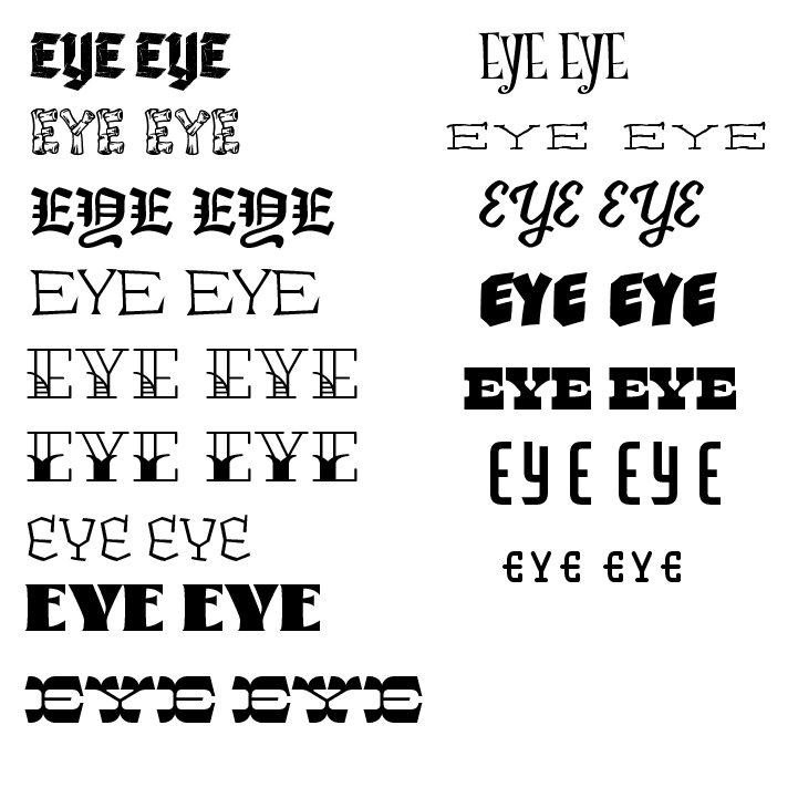
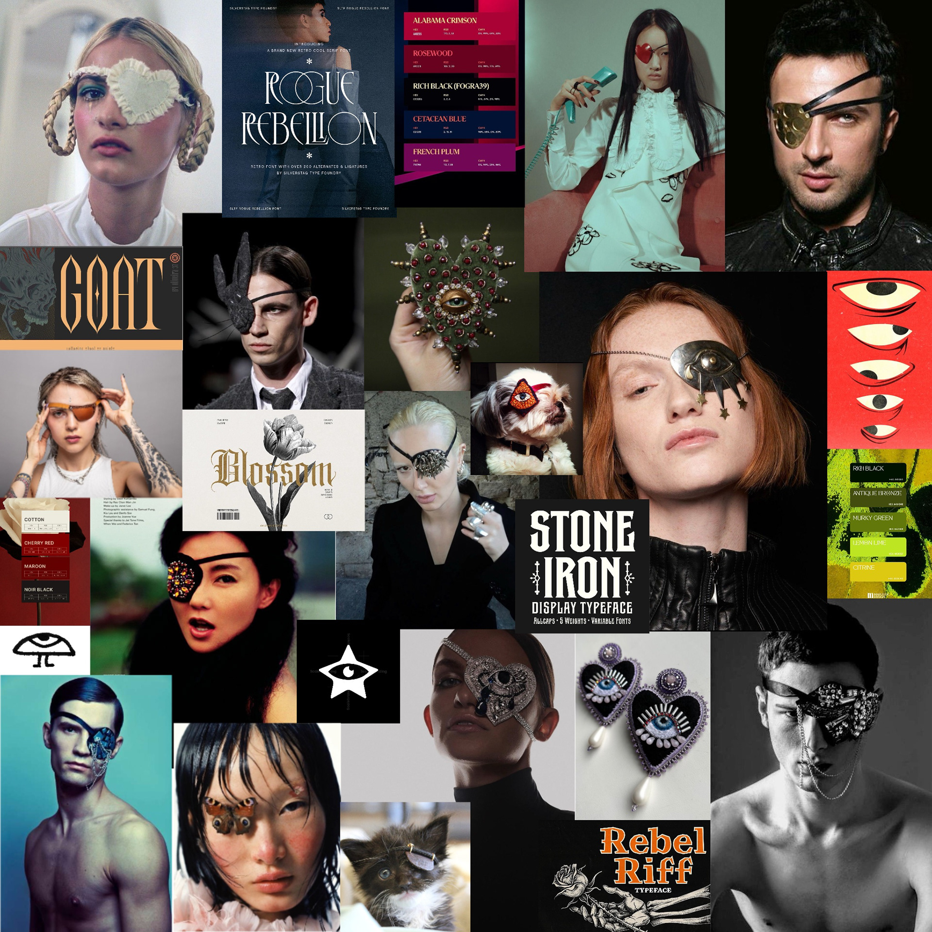
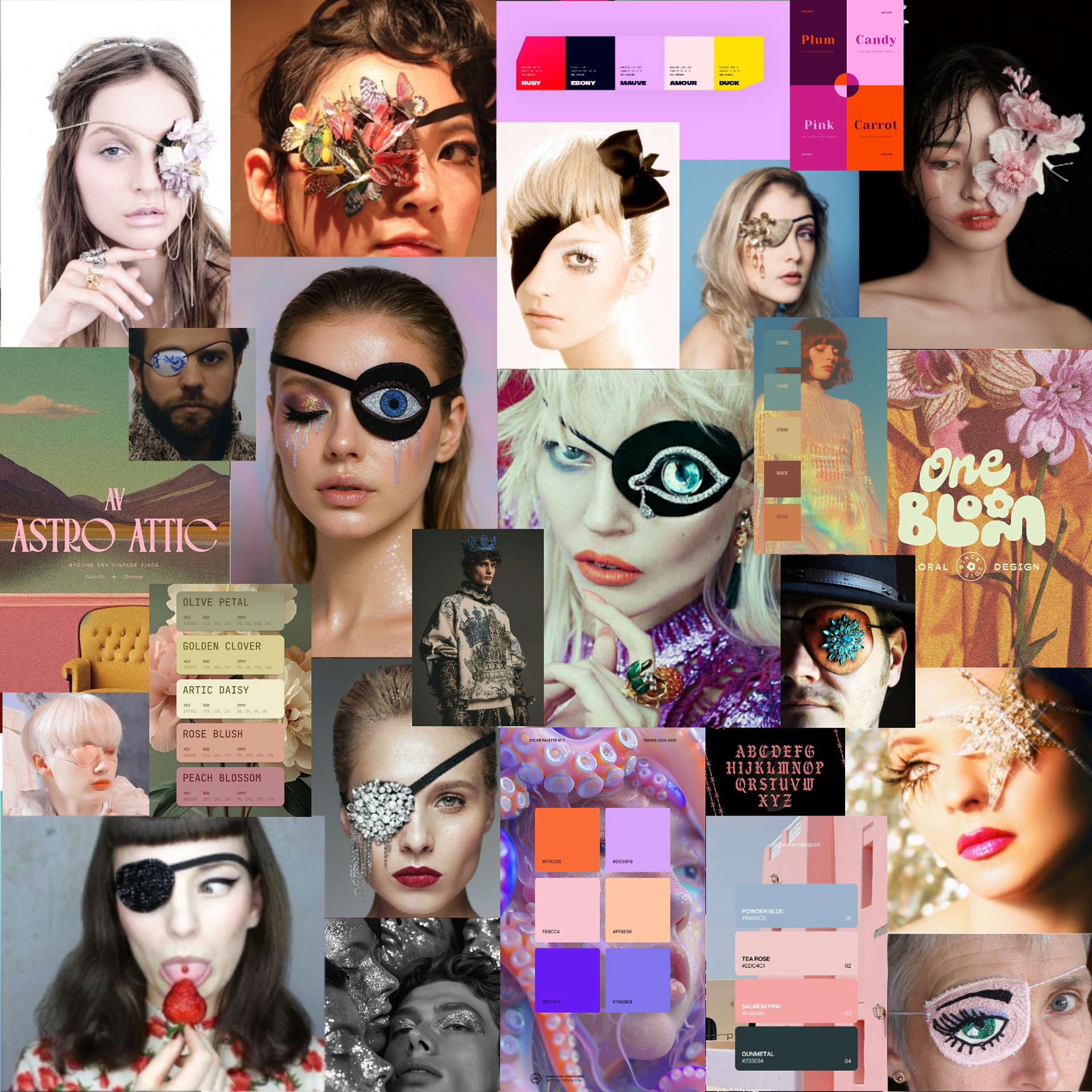
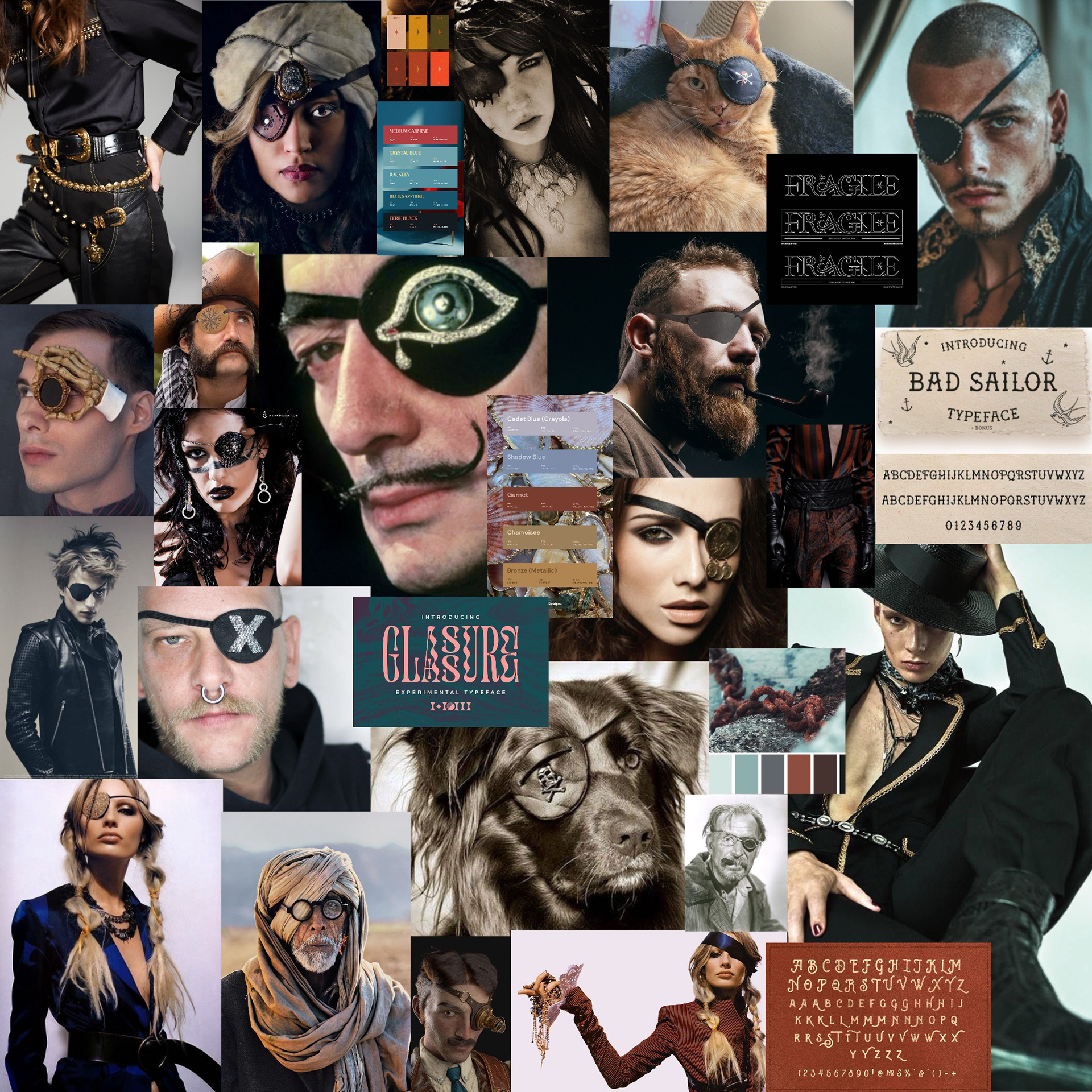
Mood Boards
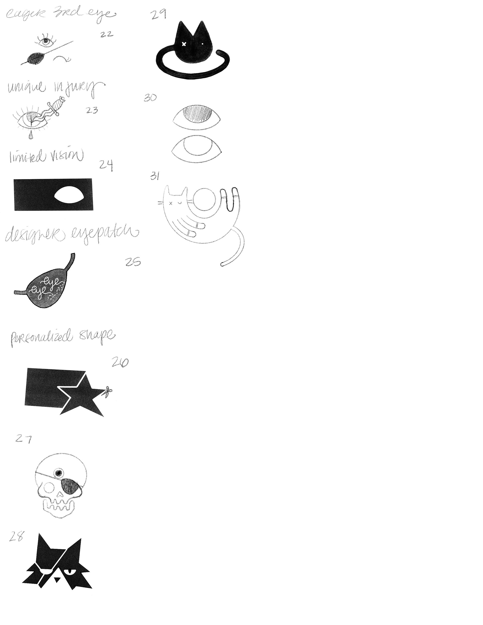
Sketches
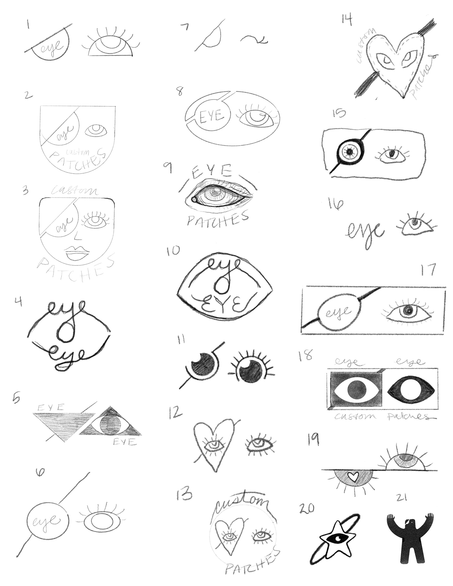
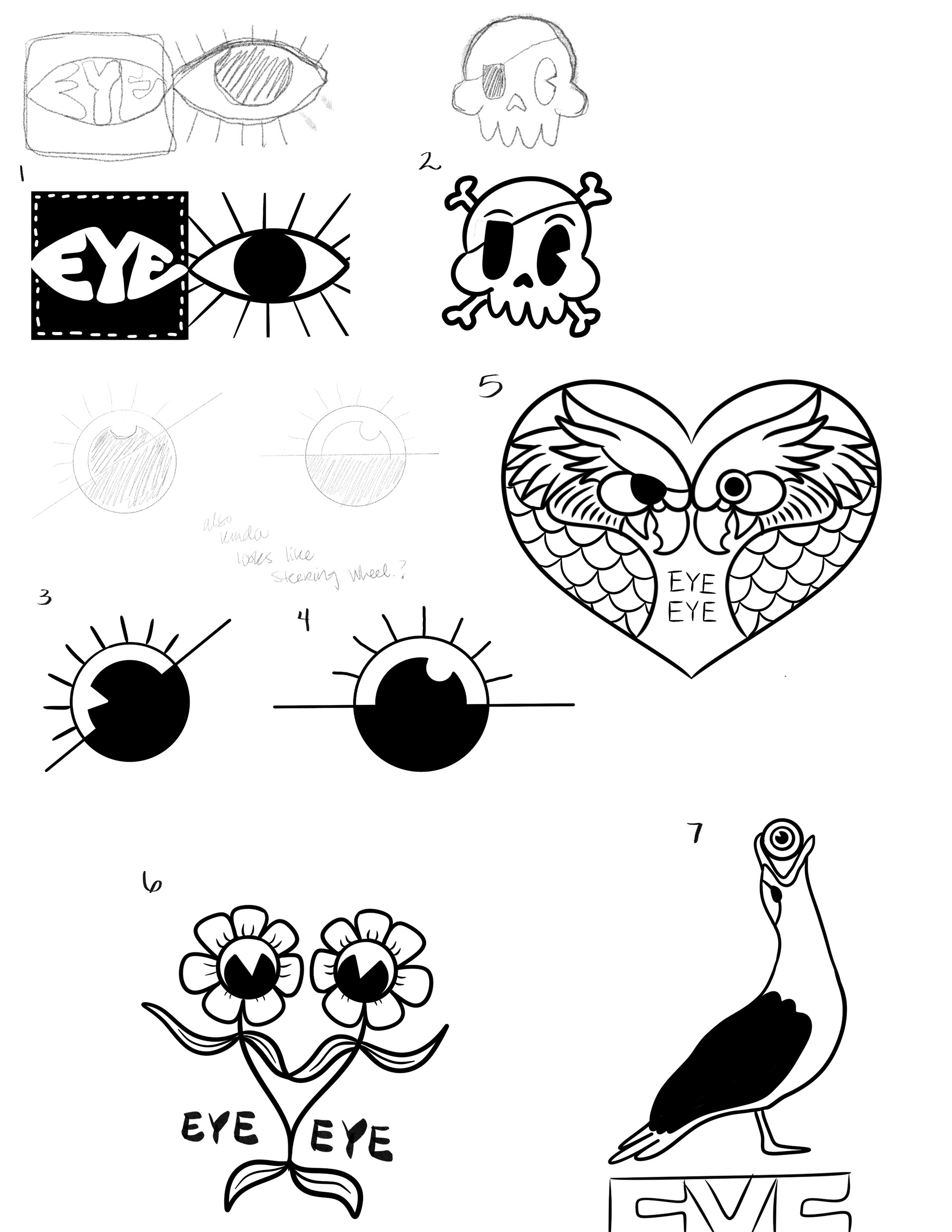
1st Drafts
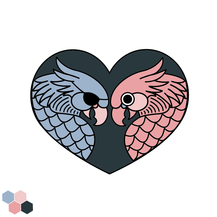
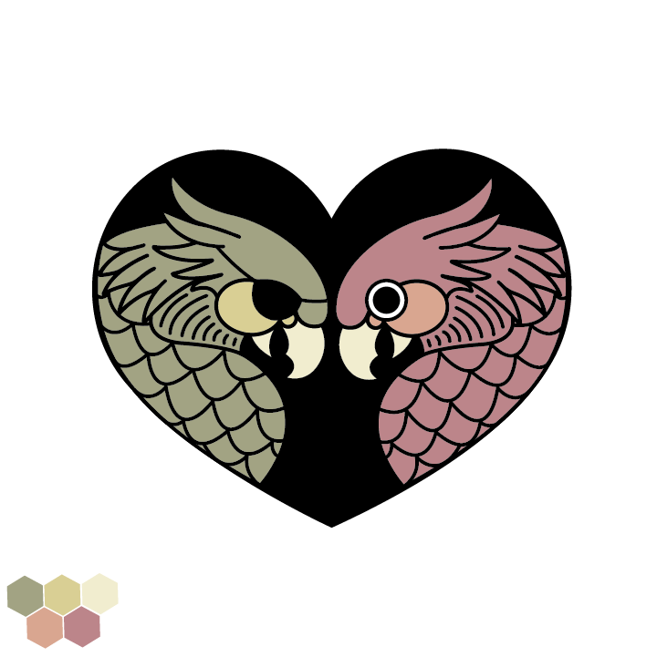
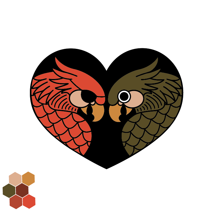
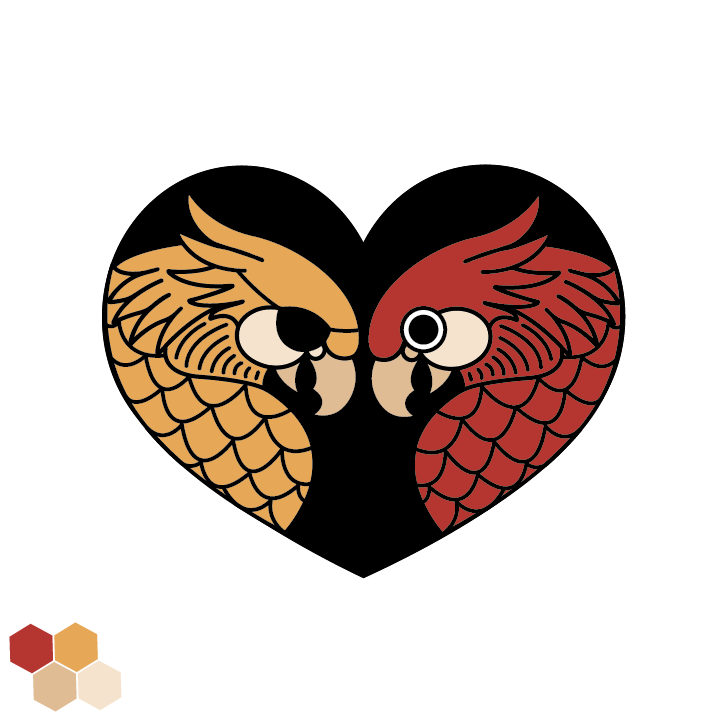
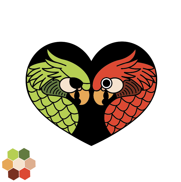
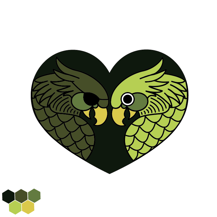

Second Drafts
Final Logo
logo Guide
Spacing
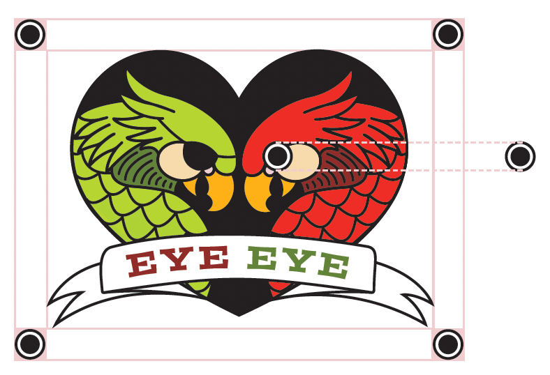
Style Guide
Primary Colors
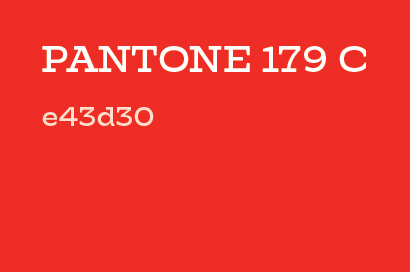
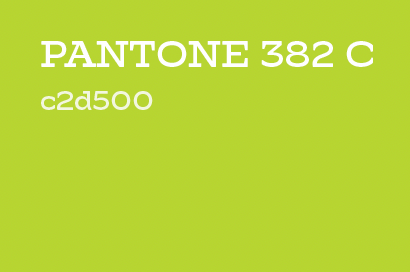
Secondary Colors
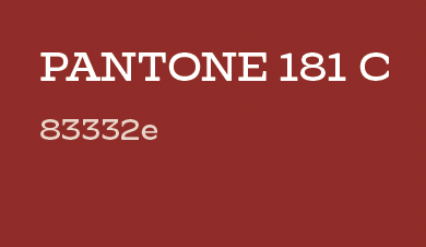
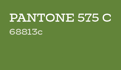
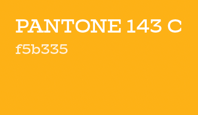
Accent Colors
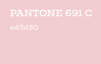
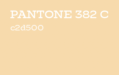
Typography
Logo:
Postino STD
Headings:
Hatch
Body:
Anonymous Pro
Brand Guideline
Please feel free to explore the guide created for this brand.